DRIVE TITLE DESIGN concept
DRIVE– THE EXTENDED PAN
The title of the film is an antithesis in its literal sense and an allegory for its lead character. It is not about the drive - but the driver. The film is an open-ended glimpse into his life, which has no attachments, material or social. It narrates a disturbance in this linear and orthodox routine of his. The sequence progresses through this linearity, introducing him and his characteristics.
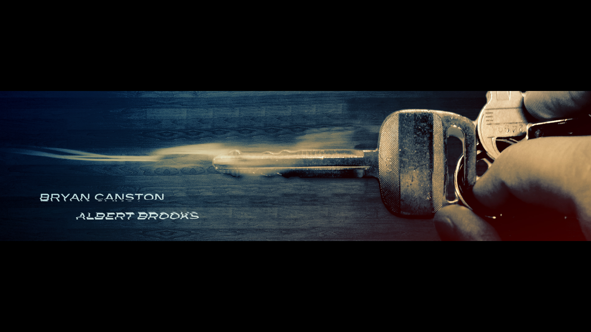
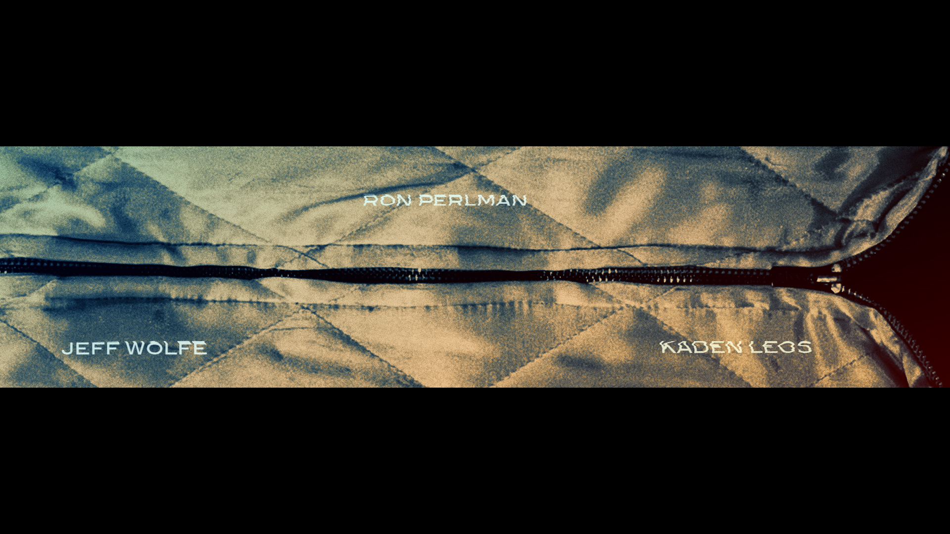
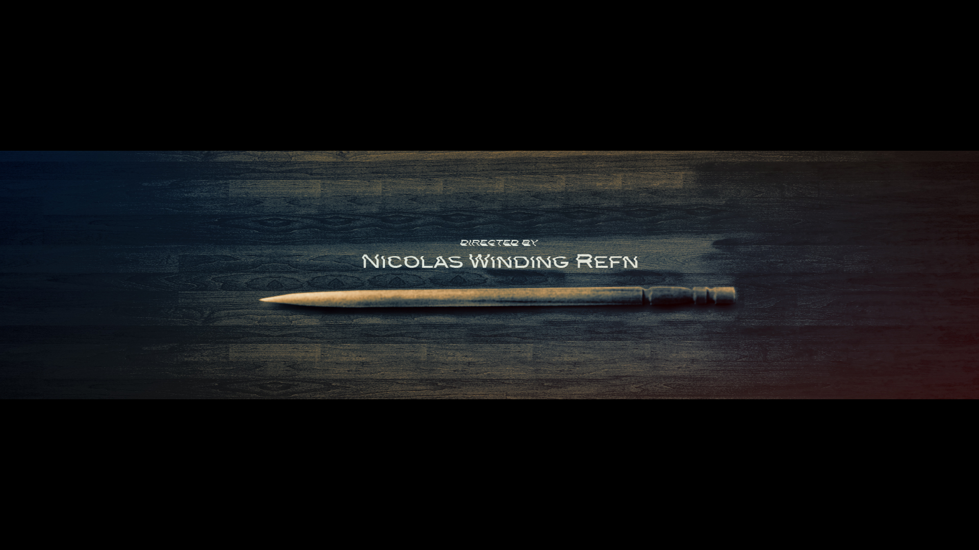
An un-interrupted pan from the left to right. The horizontal layout of the objects in the frames re-affirms the straightforward course being introduced in the beginning of the film. A heavy contrast blue and crimson colour palette reflects the contradiction between the driver’s calm, composed mental state and the chaos happening around him. A broad format BlairMd typeface represents the protagonist’s character. The type animation adds some level of controlled distortion. This sequence is a visual drive-through into the film.
Awarded BEST BOARD in Category at The Battle of the Boards - A 48 hour design challenge by the SCAD Motion Media Department.